We use cookies to make your experience better. To comply with the new e-Privacy directive, we need to ask for your consent to set the cookies. Learn more.

Using Plots in CityWater
Any presentation about water distribution management can be improved with the right plots. CityWater has a number of different plots accessible through the plot icon on the Map View page that can be used by you to visualize the information available in each of your projects. These plots can be used in reports or presentations to help others understand details and specific time-based information you need to share.
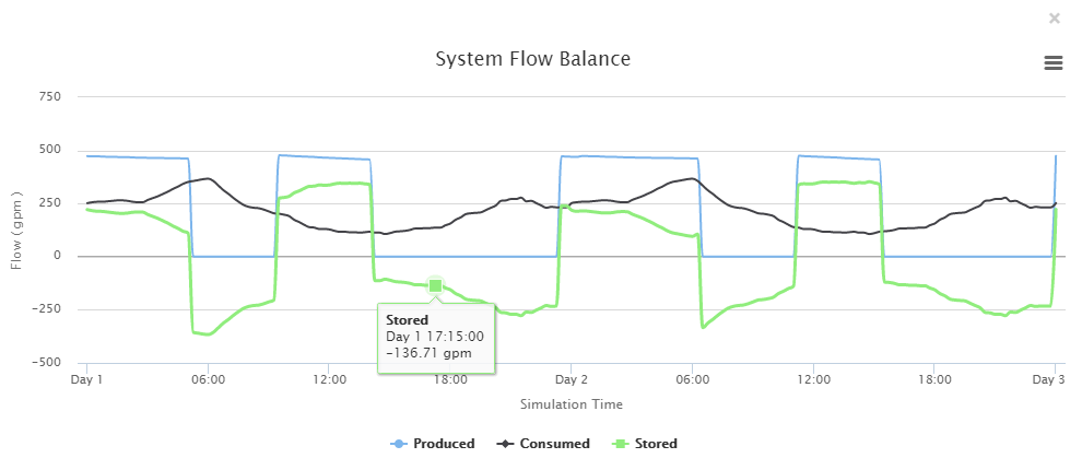
The Plot icon on the Map view is a dynamic tool. If no nodes or links are selected, it will display a System Flow Balance plot when clicked. This plot shows the flow produced, consumed, and stored within your pipe network. You can select any point along each of the plot lines to see specific for that time.
If you have a specific link or node selected (or more than one of either nodes or links selected), you can use the Layers tab drop-downs to select what will appear on the plot. This gives you a large number of possibilities for how the plot will appear. Some combinations do not have a plot available, and these will instead show the default System Flow Balance plot. We recommend taking the time to play around with the options to find the ones that will work best for you.
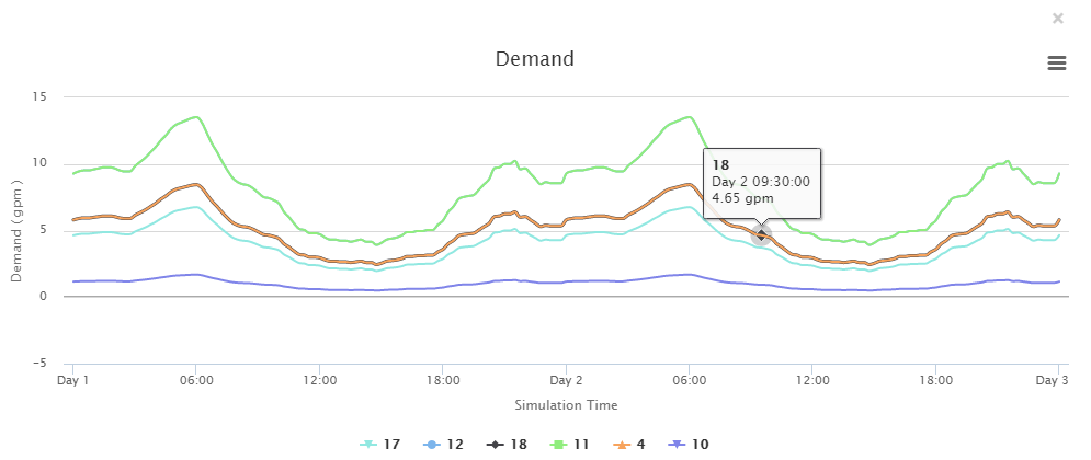
For example, the image below shows a plot with Demand, Links, and Minimum selected from the Node Layer, Link Layer, and Time drop-downs (respectively). As before, you can select any point along the plots to see specific details for the desired node or link.
CityWater contains many other tools to help you visualize water flow and usage in your water distribution network all in an accessible and a convenient to use web environment. Learn more about how CityWater can help your organization today!
July 15, 2020
|
View: 3252
|
Categories: CityWater
|
By: <a class="mp-info" href="https://aquaveo.com/blog/author/admin">Aquaveo Staff</a>
About the Author

Performing a Silent Install of XMS (Passwords & Hardware Locks)
October 10, 2018
Computing Basin Curve Numbers in 9 Easy Steps
May 16, 2023
Converting a NET File to an INP File
May 9, 2018
Performing a Silent Install for ALS
October 27, 2021
Tips for Finding Information on the XMS Wiki
September 25, 2019
Managing MODFLOW 6 Data: Lists, Copy Period & CSVs
April 21, 2026
5 Concepts for Mastering Surface-water Modeling
April 14, 2026
Comparing Multiple Design Alternatives in One Project
April 7, 2026
Incorporating MODFLOW 6 Groundwater Energy (GWE)
March 31, 2026
Essential DEM Clean-Up for Watershed Delineation
March 24, 2026